Architect: Uptic Studios
It used to be that cold and stark were the required design elements of a modern minimalist home. These days, however, you can play with textures, colors and materials to create an ultra sleek, uncluttered yet surprisingly warm space.
Janet Hollcroft knows this well. She put it into practice when she and her husband planned their Spokane home. Minimalists at heart, they wanted a modern design, inside and out, and had a very clear idea of what that involved.
“We didn’t want to compromise,” she says. “We wanted one level and a flat roof.”
They also wanted clean lines, a monochromatic color scheme, sharp contrasts and simple but strong architectural features.

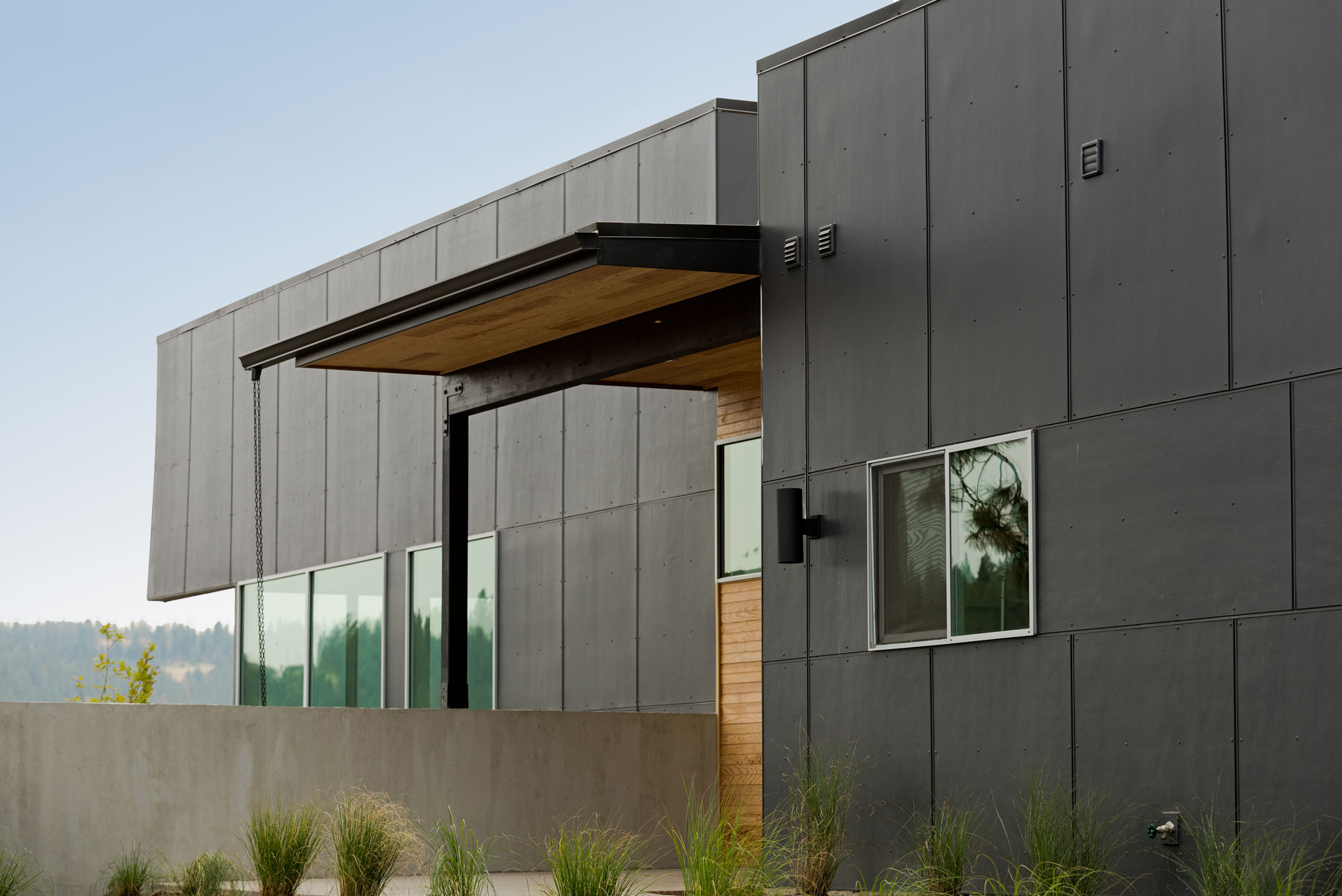
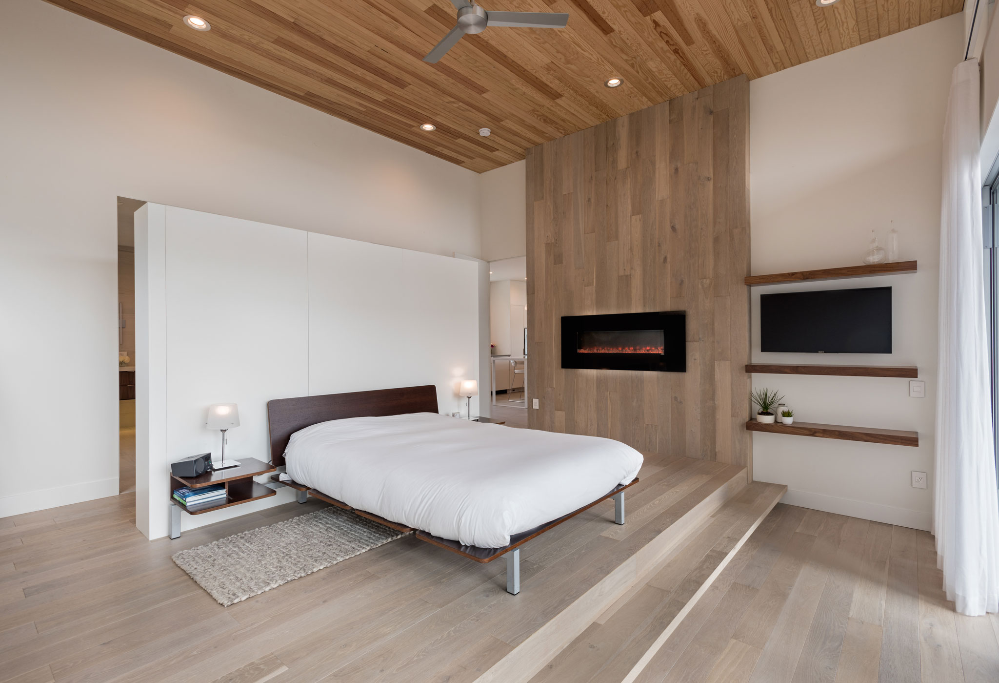
From the outside, the house resembles two large black boxes joined by an entryway. In a neighborhood lined with rustic and craftsman style homes, theirs stands out. The inside is just as unexpected. It’s light and airy. A mix of white hues and soft grays blanket the walls, floors, cabinets and counters. Creating just a hint of warmth and a ton of interest are the fir ceilings and the walnut wood accent wall that runs the length of a long hallway connecting the wings of the home. The wood wraps around the corner of the wall, flowing into the kitchen and continuing onto the center island.
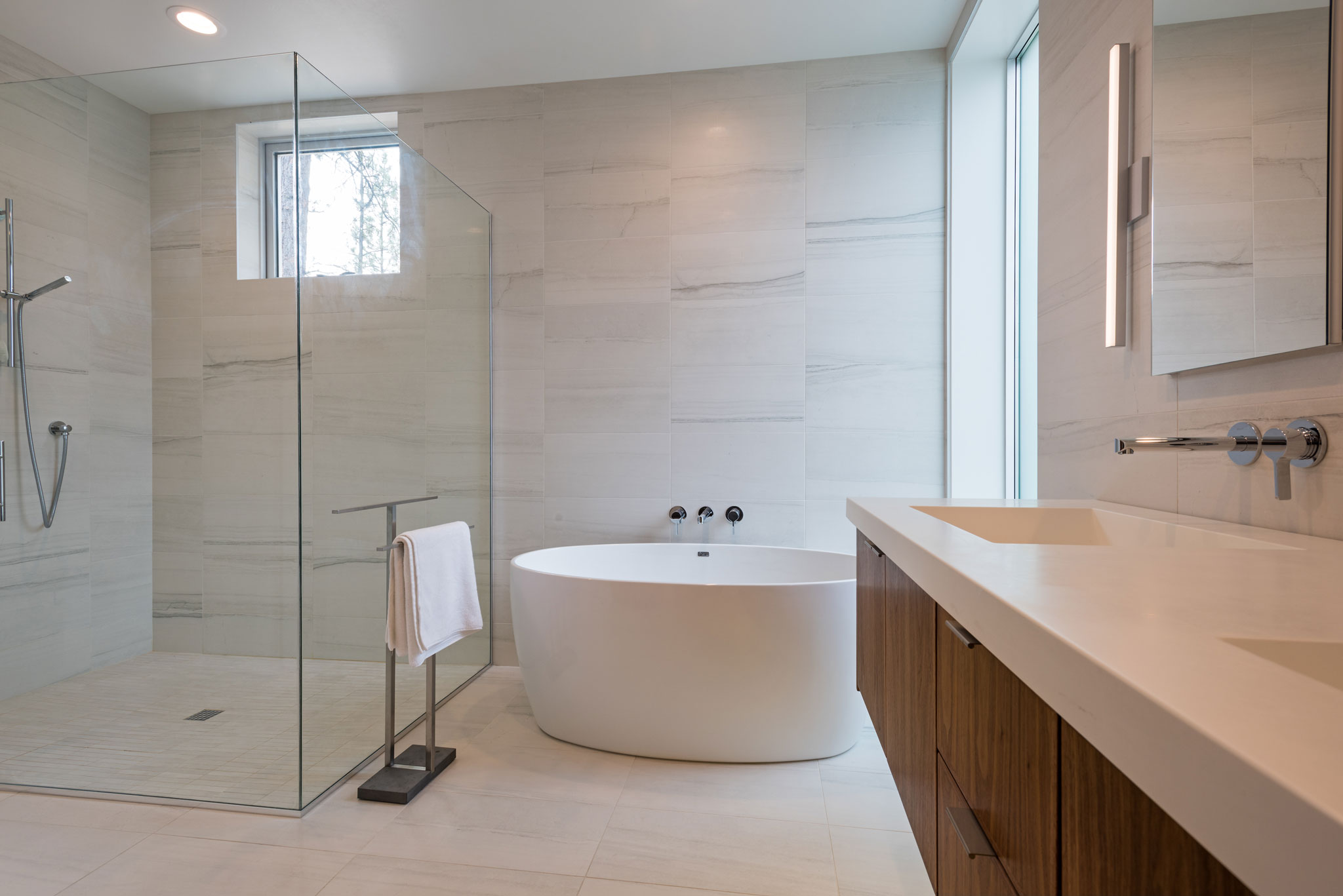
Janet is a big fan of monochromatic colors. But she also likes the contrast of the wood, not just for the added warmth it brings to the space but for its architectural interest.
“It was going to be cedar but it was too knotty,” she says. “We were fond of this fir. It’s clean and has kind of a Scandinavian look.”
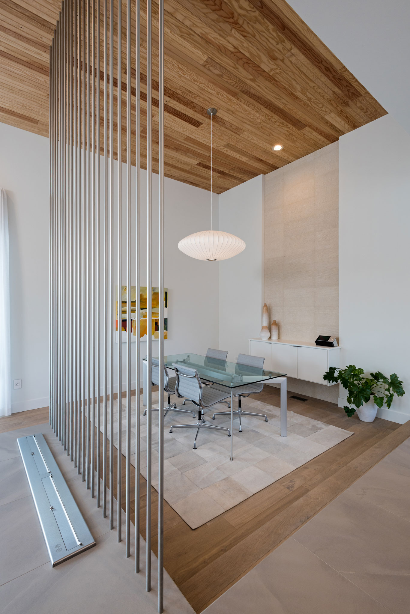
The home is nearly 4,000 square feet, smaller than their previous multi-level modern home in Portland. It’s divided into two wings: A guest quarters that includes a bedroom, workout space and a powder room, and the main living space that includes the kitchen, family room, dining area and master suite.
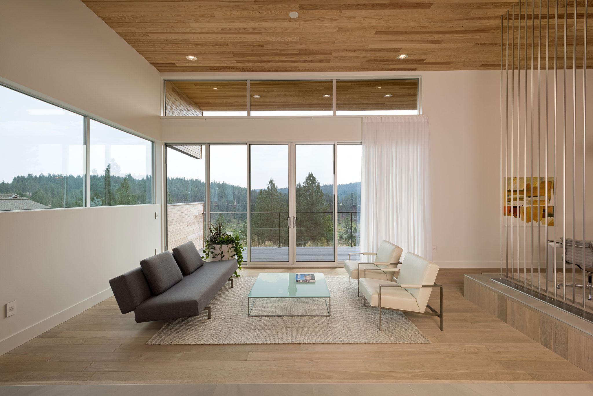
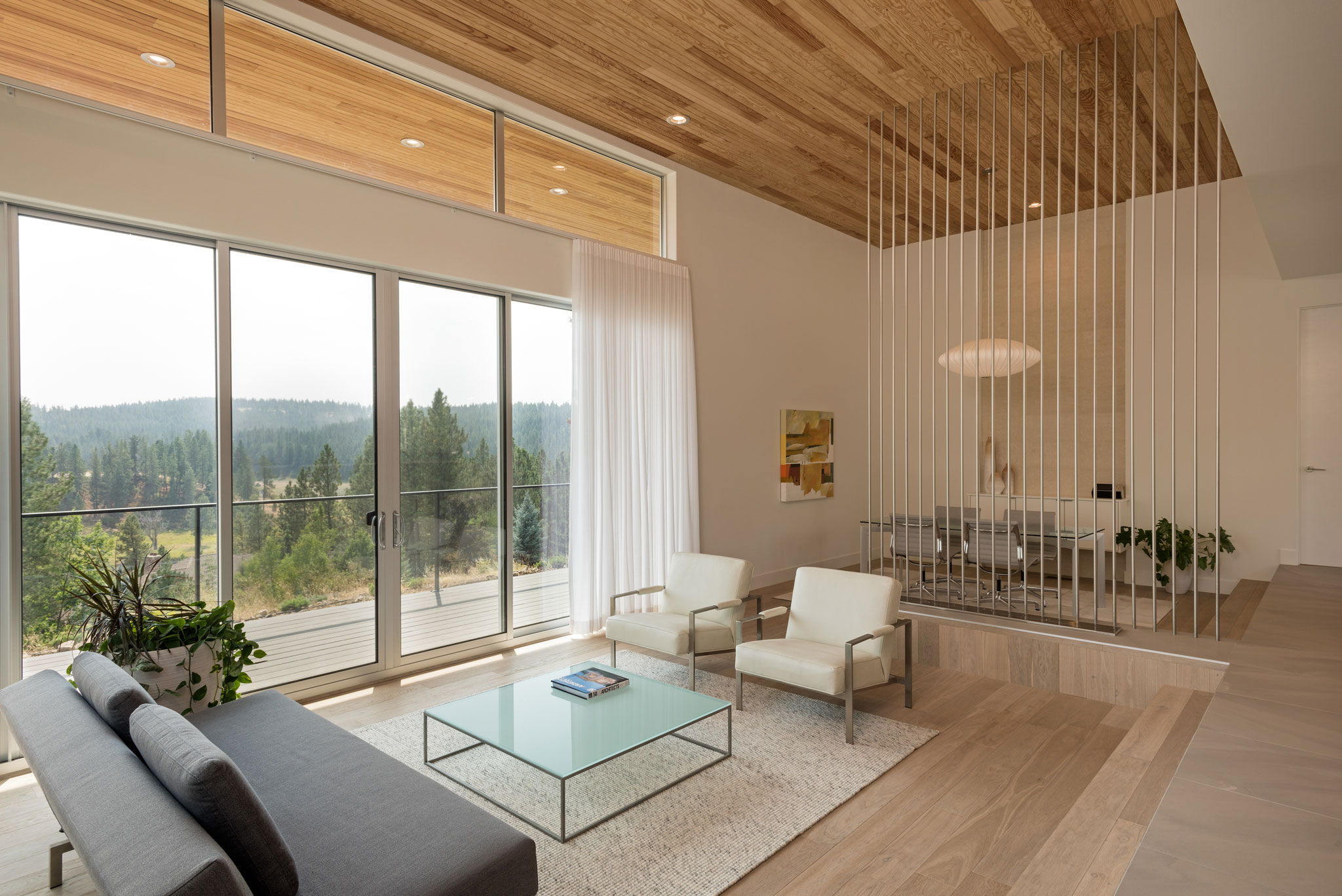
The great room and dining areas are sunken. Think Brady Brunch, except in this case a floating step runs the entire length of the room. The elevation change allows for an unobstructed view of the outdoors, which is framed by a glass wall that opens to the deck.
“We just liked the interest of it and change in elevation,” she says. “We spend a lot of time in the kitchen. So we like to see the view.”
Story continues after a quick message from our sponsor below.
Of the more interesting architectural features are the floor-to-ceiling steel rods that subtly separate the dining and family spaces.
“We loved the design when we saw it,” Janet says. “It’s a great room divider but still leaves room totally open.”
Janet admits hers is a very modern home, but not overly so.
“Ours is classic modern,” she says. “It’s not George Jetson.” N
By Kristina Lyman
Photography By Joel Riner
As Featured In: Winter/Spring 2018 SPO Edition
