Some sensible person once remarked that you spend the whole of your life either in your bed or in your shoes. Having done the best you can by shoes and bed, devote all the time and resources at your disposal to the building up of a fine kitchen. It will be, as it should be, the most comforting and comfortable room in the house.
I vividly remember the kitchen of my childhood home. No matter what the days would bring, we always gathered there for dinner. Our kitchen was, as most are, the hub of the house. It was where lighthearted, and serious conversations took place, where endless card games were won and lost, and where many of my family’s major decisions were made. So important was our kitchen, it was the first room in our house to get an update—and the only room for years. Out went our beloved avocado green dining table, the green refrigerator, and the matching Formica countertops. It was the late 80s, and my mother’s idea of modernizing included a glass table, a black refrigerator and beige counters. Even our dark cabinets were lightened. Suddenly, our drab kitchen felt crisp. And we, having lived with avocado green for longer than anyone should, felt liberated.
Kitchens have endured as the center of the home. But their look has undergone great change over the decades. You won’t see avocado green or harvest gold in today’s new builds. Thankfully, that time has passed. In fact, you might not see much color at all. These days, the trend is white, even here in rustic North Idaho.
White kitchens are not new but they have not been common, either. Most kitchens here are rustic, paying homage to the rolling mountains and pine forests that blanket this region. White, however, has become increasingly popular in kitchens over the last few years. Designers and builders point to a variety of reasons but it comes down to this: white is timeless. It’s clean, bright and a break from the traditional.
Story continues after a quick message from our sponsor below.
“It’s what everyone wants,” says designer Eric Hedlund. “People are tired of really dark kitchens.” He ought to know. Eighty percent of the kitchens he designs these days are white. The rest are rustic.
Cool or warm, we love our kitchens. They are the place where we always seem to gather; where we nourish our bodies and often our souls. Kitchens are the heart of the home. So, why not make them the gem, too.
Beach Meets Mountain
Builder: Gunder Construction
Architecture: Eric Hedlund Design
The Moores love Black Rock. But they didn’t want a “Black Rock” home. So they built a mountain contemporary house with a
bright white kitchen. It was a break from the intensely rustic style that dominates the lakeside development. But when this Dallas, Texas family first arrived at Black
Rock, they didn’t see hills and trees. They saw blue sky and water. Their kitchen reflects that vision.
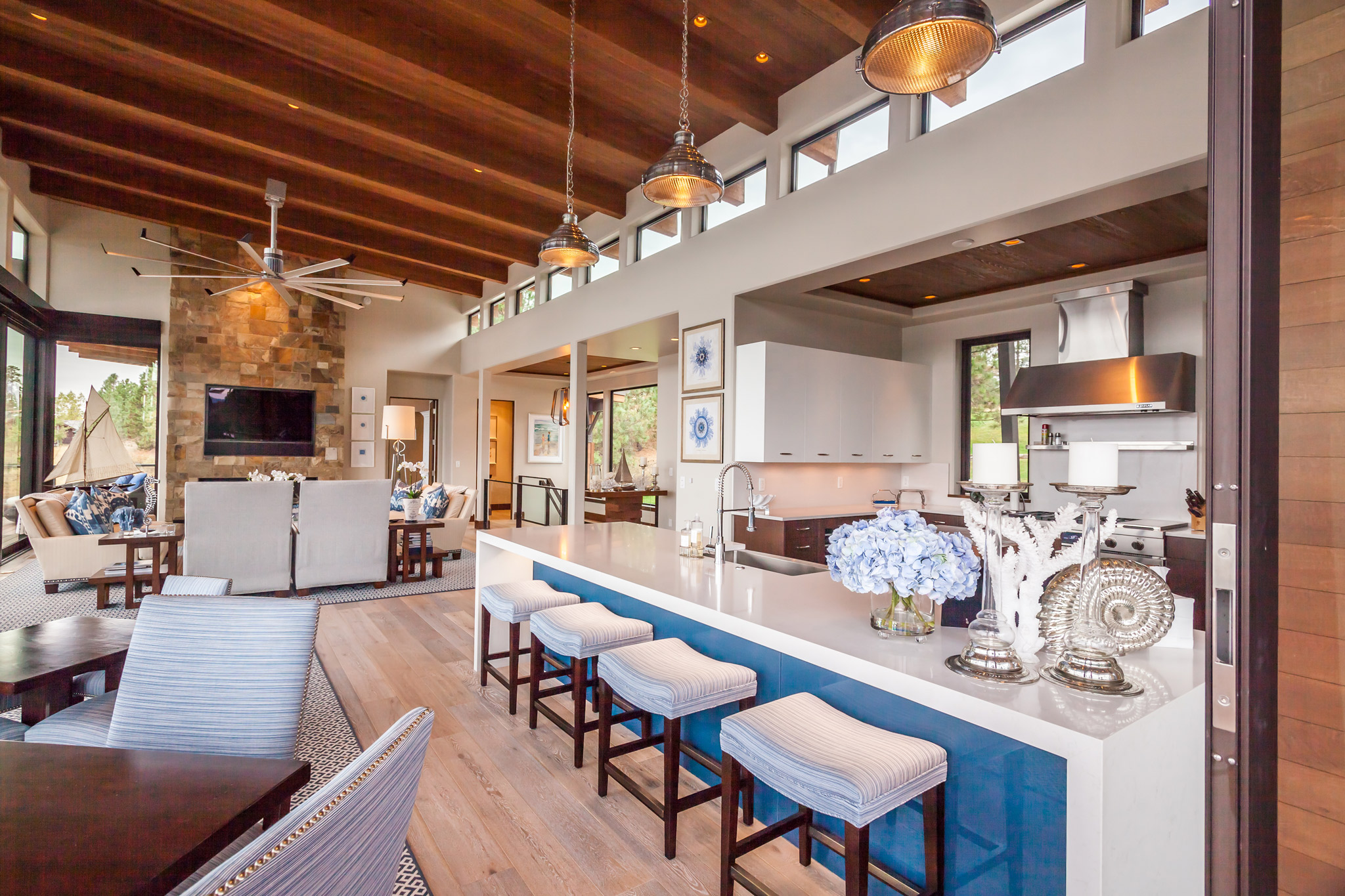
Ultra white lacquer cabinets give off a brilliant shine and create the clean, bright look Sandy and her husband Barry wanted. The contrasting Echo wood cabinets (engineered wood veneer) and Douglas fir ceiling keep the kitchen from looking too modern. Most impressive is the 12-foot-long waterfall island featuring a decorative blue glass lit with LED. The glass pulls in blues from around the room and gives the place a relaxed beachy feel.
The island is the centerpiece, not just of the kitchen, but also of the entire main floor.“No matter how you build your home, you always end up in the kitchen,” Sandy says.“So we just made it part of the greatroom space.”
One “Cool” Cabin
Builder: Doric Inc
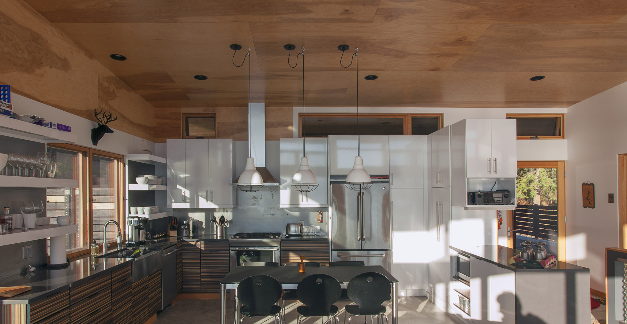
Among the majestic homes that surround Lake Coeur d’Alene stands an impressive industrial cabin. It’s not size that forces you to take notice of this beauty. It’s a modest 1,600 square feet. What grabs you is its unique design. It is neither modern nor rustic, yet it combines elements of both styles to create a bright and cozy space.
The kitchen alone is a study in the balance of colors, textures and styles. White laminate cabinets, Caesar stone countertops, and a cold rolled steel backsplash create the industrial style the homeowner wanted. The cabinet-grade plywood ceiling brings in the outdoors and gives warmth to the space. Wood veneer cabinets and their pattern of earthy tones add depth. The contrast of colors and the mix of textures make this kitchen appear larger than it is.
The goal from the start of the project was to end up with a place that felt like a cabin. This home feels like that and more.
A Vintage Backdrop
Designer: LGD Design
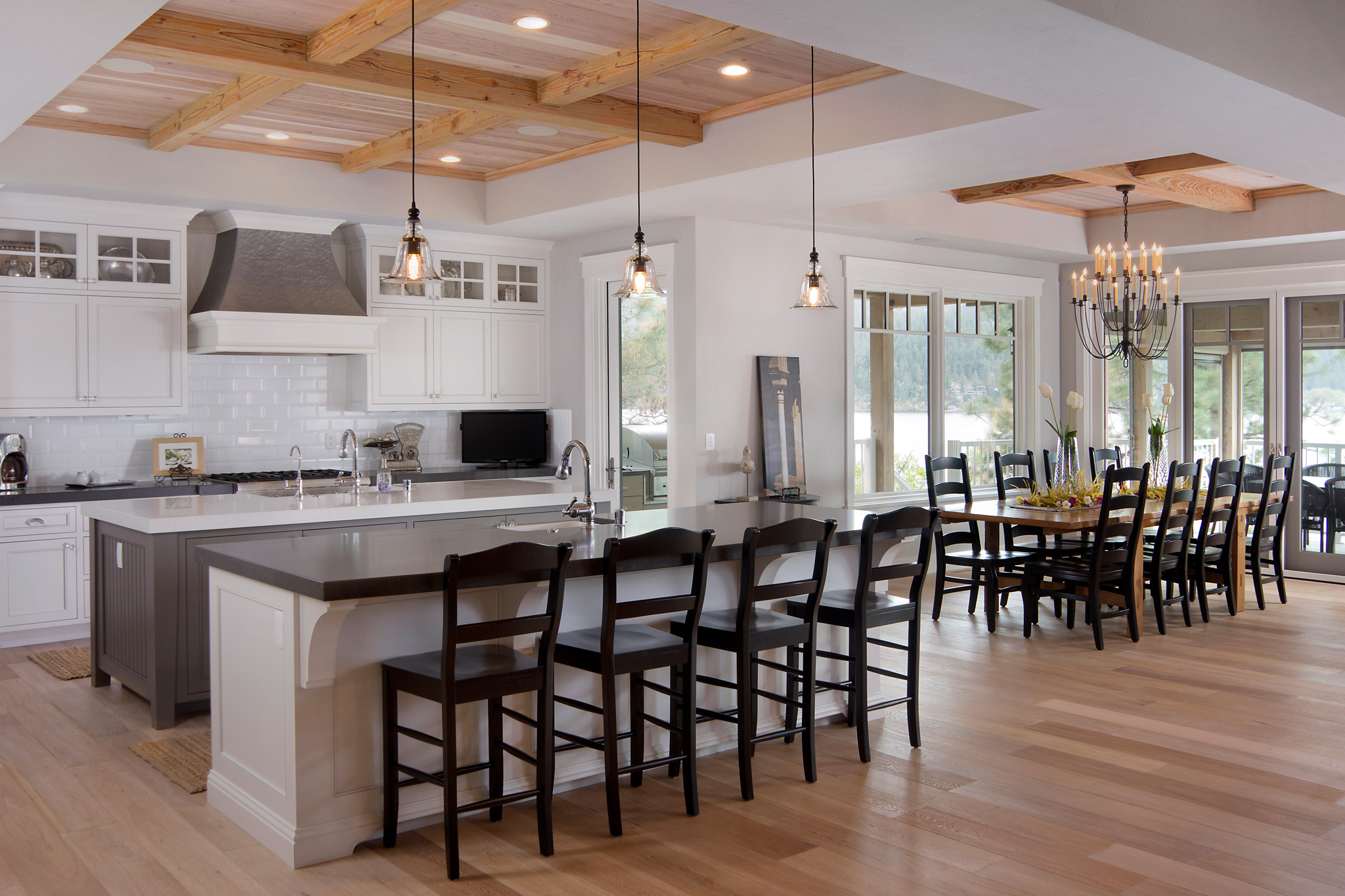
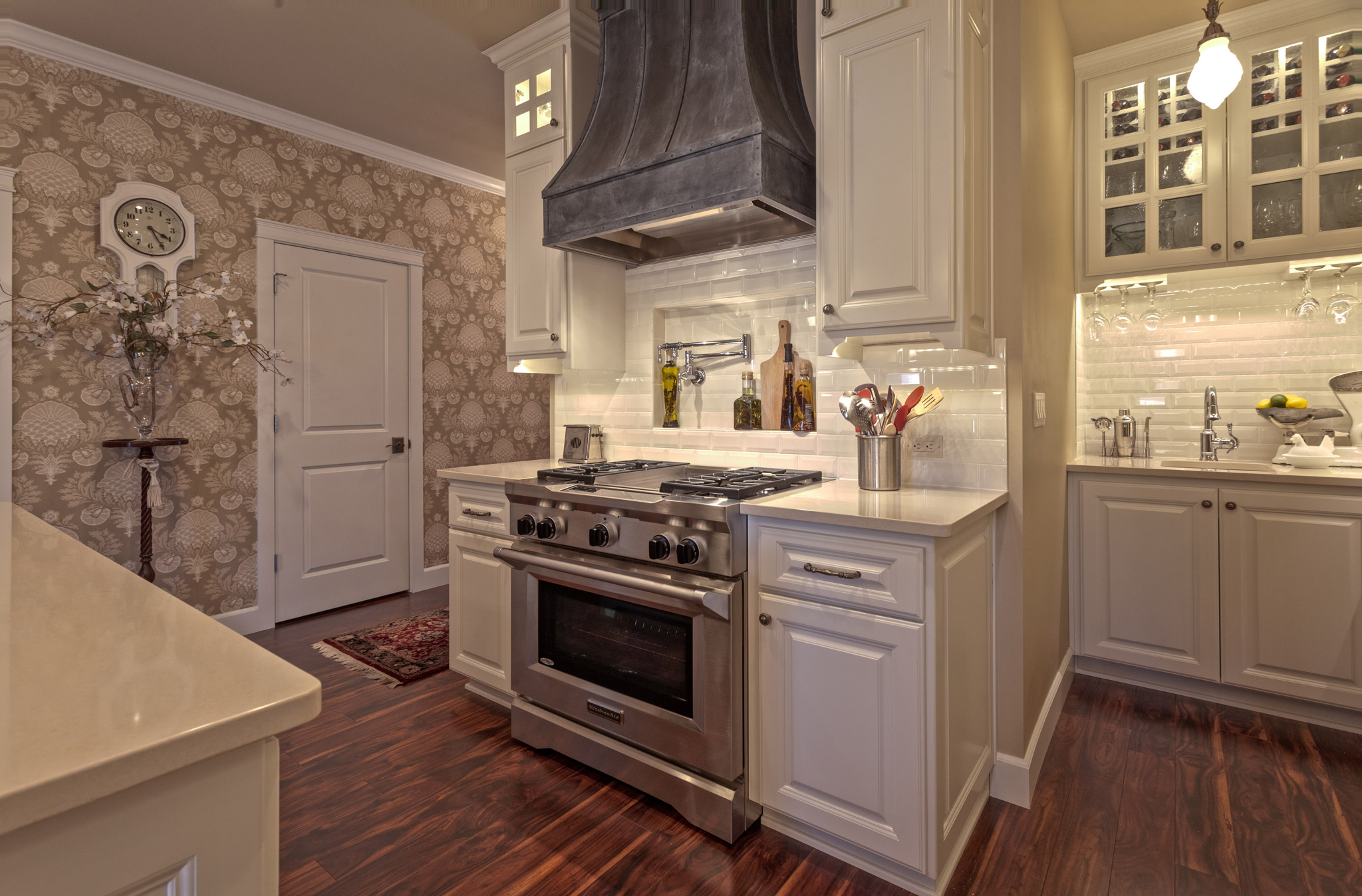
Gregg Johnson has been designing kitchens for 19 years. So when it came to building his kitchen, he took a page from his own design book. He went with white. “White is classic,” he says. “It goes with everything.”
His cabinets are a white automotive lacquer, the popular finish that is as incredibly smooth as it is shiny. “It’s like running your hand across the hood of a car,” he says.
He added a dark wood laminate floor for a warm contrast. A faux cast iron hood above the stove and classic light fixtures complete the vintage look he was going for. It’s the perfect backdrop to what really matters in his kitchen: time with his wife and children.
“It’s a great family spot,” he says. “It’s where we hang.”
Inspired by Pinterest
Builder: MB Builders
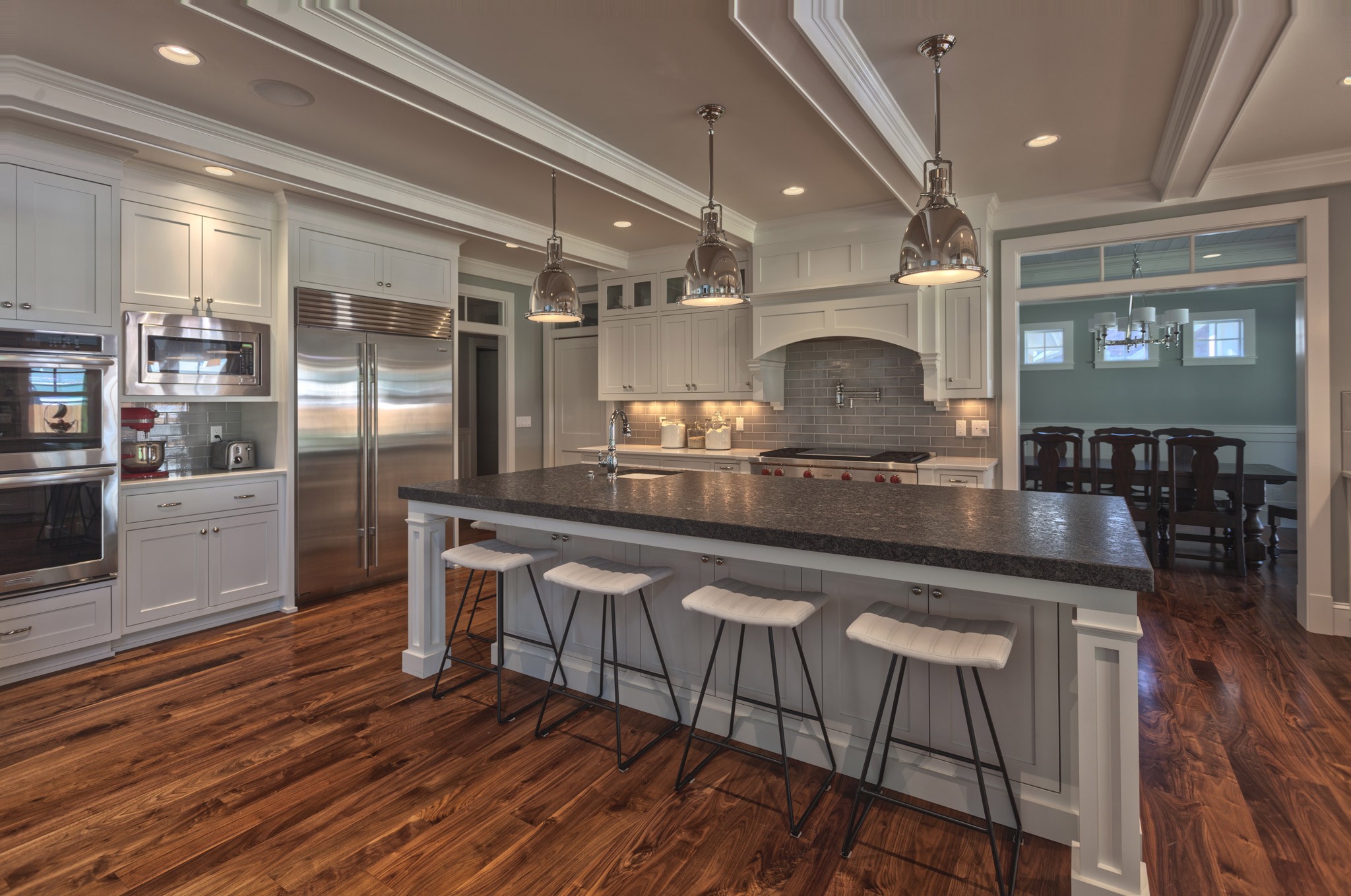
Kim Dance didn’t need a designer to give her the kitchen of her dreams. All she needed was Pinterest. She scoured the popular bookmarking site, finding images of beautiful white kitchens and pinning them to her board. She then showed her builder the photos, each one representing a part of the kitchen she wanted.
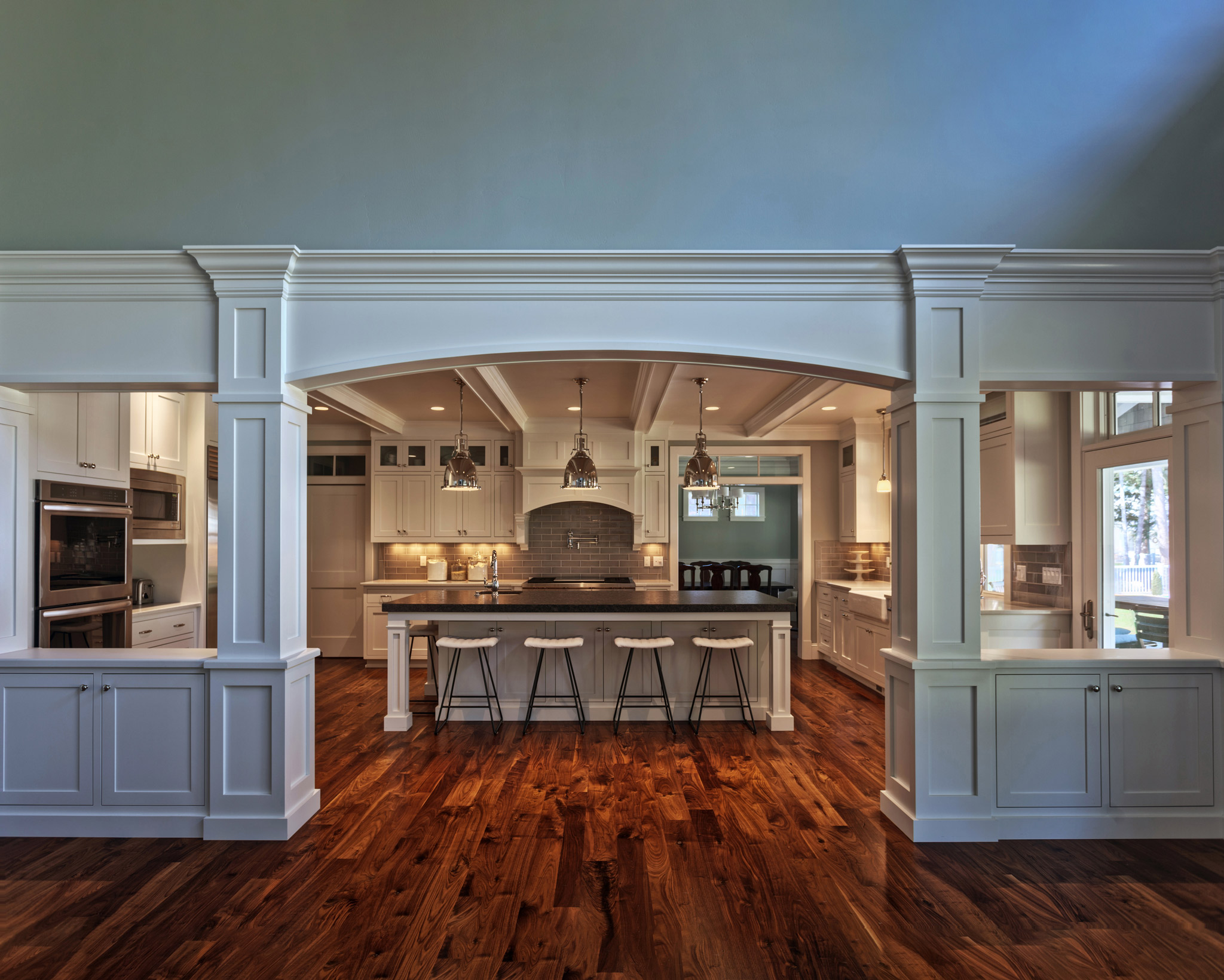
Kim has always liked white kitchens, especially the light, airy Cape Cod style popular on the East Coast where she grew up. So she and husband Tom went with a similar look for their new kitchen. To add character to the all-white space, they chose glazed walnut for their floor, and Arabian black granite for their island, Kim’s favorite feature. The island easily accommodates the family of six and is perfect for entertaining.
“I love to host, and we always have a lot of people in my kitchen,” she says. “Someone’s chopping while another is cooking and everyone’s talking. It really is the heart of my home.”
By Kristina Lyman
As Featured In: Summer/Fall 2015


